How to create the best call-to-action
“Buy now”. “Sign up here”. “Download our white paper here”. You know them, those short sentences that start with a verb in the imperative. Marketers call them a ‘call to action’, or a CTA. You see them everywhere, and they were created to convince people. To turn leads into customers somewhere further down the funnel. You can publish all the content in the world to attract people, but without a CTA, none of that really matters. So how exactly do you create a good call to action?
What is a call-to-action?
A CTA encourages people to take a certain action, as the name itself says. It helps you communicate to your visitor what the purpose is of the page they are n. A good call-to-action will help you get an ROI from your website. It makes sense: using clear and convincing CTA’s, will help your audience take the desired action.
There are many different types of CTA’s:
- Subscribe to our newsletter
- Download a document
- Make an appointment
- Contact us
- Read more
Purpose of a call-to-action
A good CTA guides your visitor through your website towards a certain target. They literally show your visitors the way. Just like real signposts, you place them in a well-thought-out place. This will ensure that people don’t get lost on your website and end up leaving without reaching their target.

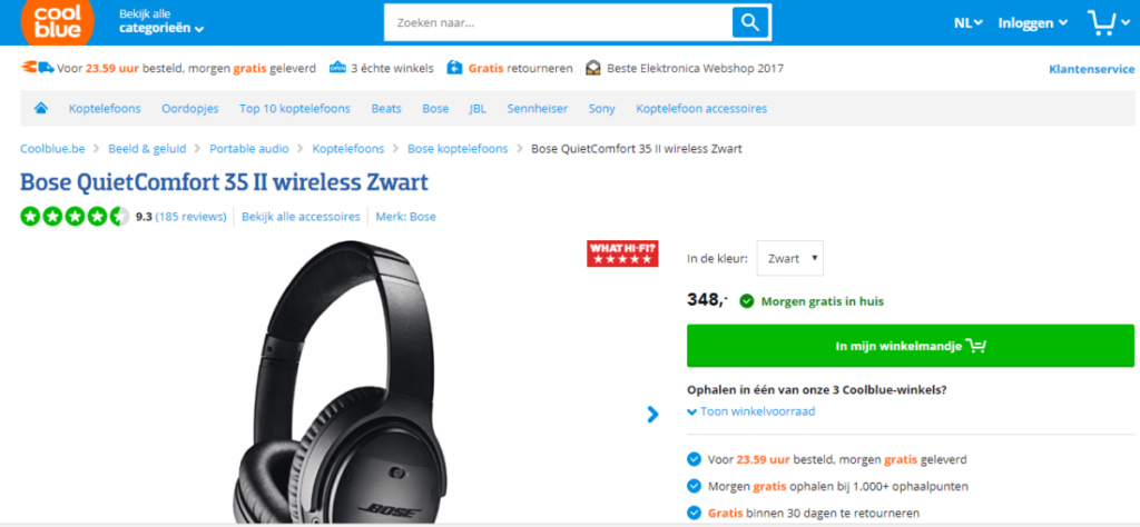
Think about where you want to use which CTA. For example: ‘Order now’ as call-to-action on a webpage where there are no products, is just stupid. You guide visitors through a logical process on your website or via email campaigns. Then also you need to build your call-to-actions logically. The text and color you use for your call-to-action should also support your goal.
How to write a good call-to-action?
Writing good CTA’s is not as easy as it looks. Writing the perfect call-to-action can take some time. It is a process of thinking, writing, deleting, testing and adjusting. Test with different versions and then build on your findings.
Determine the purpose of your page
It all starts with the thinking process about what you want to reach with your page. If you have 10 different purposes with one page, it will be very difficult to convince people. How on earth are they supposed to know what you expect of them? Define one goal per page. When you have done that, defining from that call-to-action will be a lot easier. Is the purpose that people can register them for an event? Make sure that the page talks only about that. Do you want someone to order a product or service? Then make sure there are no news articles or photos of your open house on the same page, for example.
Be clear
This one is closely related to the last point. When you publish a call-to-action, make sure that it unambiguously says what you want your visitors to do. Do you want them to download a document? Make that clear in your copy. If you keep it vague, your visitors will not know what you are asking from them. The chances of them effectively taking action becomes much smaller.

The right words
Think about the right words for your call to actions. Writing them in the imperative helps your visitors. Your message becomes much more powerful. Especially if you also use power words. But don’t overdo it: you don’t want to come across as aggressive or pushy.
Less is more
Keep it to one call to action on your page. When you give your visitors more choices, it doesn’t mean that you will get more interactions in the end. If people see too many options on your site, they will eventually not choose any of them, meaning they will not take action at all. And that’s not the point of a CTA.
Add your header
The place of your call to action on your site plays a big part. It doesn’t make sense to put your CTA at the very top. Visitors don’t know what your page is about at that moment. Don’t hide your CTA into a mass of text where it’s hard to find. Remember: they are not on your website to play ‘Where’s Wally’. There is no clear rule on where to place your CTA. It depends on your offer, your content, your sector etc. Just experiment with it and adjust.
Use colour
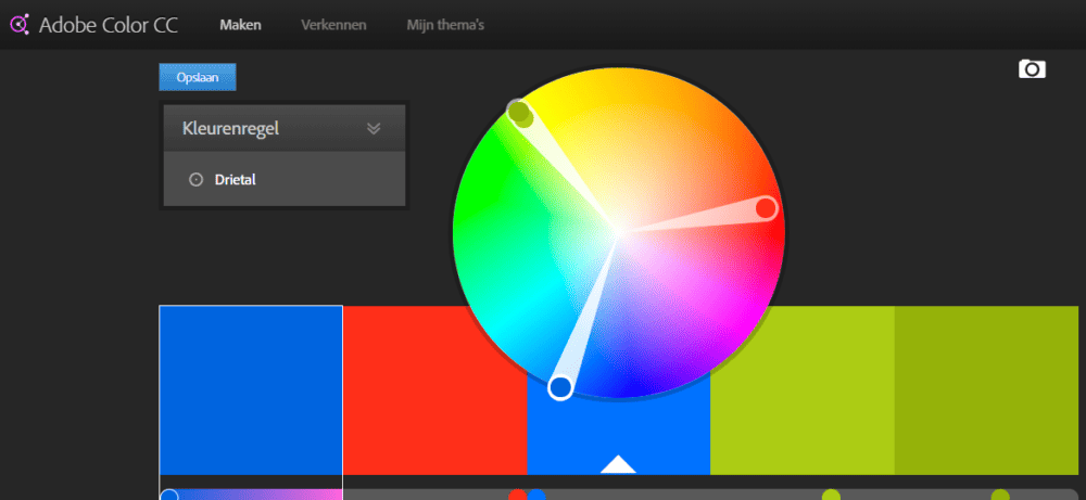
You most probably have a color or a combination of colors in your corporate identity. Make sure your CTA stands out. Contrasting colors stand out well and quickly attract the attention of your visitors. Adobe’s Color Wheel can help you to find a suitable color for your CTA.

Keep on testing!
Despite the many practices you can find, there are still some factors that can make it just a little bit different for you specifically. Test frequently what works best for you and keep doing that. Your business evolves, your visitors too. What works today may not work anymore a year from today.
Get to work!
Tips are great on paper, but what really counts is to get to work. Use these tips, but evaluate critically if they are useful in your situation. Do you have other tips or want to share your experience? Contact us.
Want more marketing?
Thanks for visiting us and discovering our marketing tips. Do you want more? Sign up for the Upperscore Updates. We’ll keep you up to date with the latest marketing trends, new features in your favorite marketing tools, exclusive invitations to inspiration sessions and much more.


